Categories
Design Development UX

Jack of all trades, master of none? I think not.

Is a line being drawn in the sand about what makes a Web Designer?

Possibly. While i agree with some of this excellent article written by GORKA MOLERO, there are some parts of it that are a stretch for me.
I have a lot of respect for Andy Rutldge but I’ve never really agreed with this:

‘A designer who does not write markup and css is not designing for the web, but drawing pictures’

I think there is always going to be a seat in the room for a UX/UI designer that isn’t necessarily an expert at Front-End/CSS or jQuery. Personally I would trust a UX/UI designer to craft the look and feel of a site/product over an expert coder. I mean, have you seen sites created by IT teams or people that have spent the past few years becoming an expert coder? YIPES! I think a designer and developer is a team not one person. This team should be the best at what they do and be able to finish each others sentences so the product is as good as it can be. They should be able to talk each others language and even dabble a bit in each others world. But leave the code to the coders and the design to the designers. Agile and Lean UX/UI techniques play well in this scheme if you have the resources.

I think when you ask one person to be great at both design and development, they suffer from being a “Jack of all trades, master of none.” This produces a sub-par product. But just my 2 cents.

Categories
Design

UX Design Philosophy

I was asked recently by a fellow creative what my UX and Design philosophy is. I was taken back by the fact that I didn’t have a solid answer for him. I’ve been bouncing this around in my head for the past few days or weeks or however long it’s been, and I think I can finally put it into words. Before working at Dicks Sporting Goods, my philosophy for digital creative was actually more of a differentiator between what I thought digital vs traditional creative was. “Traditional creative is simply consumed. Digital creative is actually being used. It is a product, not just a pretty picture. It has to WORK.”

“The user is ALWAYS right. I am NEVER the user.”

To me this says it all. No matter what you think you know about design, or usability, or creativity, if the end user doesn’t get it, you fail.

This is at the core of what being creative is all about. If you can open your mind up to the fact that you’re not always right, in fact you’re probably usually wrong about what your end user thinks, then you’ve reached a point in your career that you can truly be a creative. This is what separates digital/ux creatives apart from the rest. We want to know what works, what converts, what makes the needle move. We can actually go out and find out what works and what doesn’t, we can test and iterate and modify our product to best meet the needs of our users or our clients users. This doesn’t make us less creative, quite the opposite.

This philosophy is worth more to me than an ADDY or WEBBY because to me, at this point in my career, a satisfied user is the real prize in this game of digital marketing. Some might not find that appealing as a creative or marketer, but it’s what gets me up every day.


Categories
Design UX

What Does a UX Strategist Do? :: UXmatters

I found this great article today asking the question What Does A UX Strategist Do?  The term UX is still new in the common folks lexicon but it gaining traction.

Here are a couple of definitions that I tend to agree with:

a UX Strategist uses consumer insights he’s gathered from research, psychology, and UX best practices, takes a consumer-centric approach to helping an organization make strategy decisions, and acts as a change agent within an organization.

It goes all the way from defining the strategic objectives—vision and strategy—to team objectives and tactical plans, as well as execution and monitoring.

I also found it interesting that this question even needs to be asked. But it’s a good idea for those of us who are trying to take lead in this field (and UI) to all get on the same page early on so that the job doesn’t get fragmented… ie. “web designer”.


Categories
Development

Adobe Labs releases “Shadow” to help with RWD

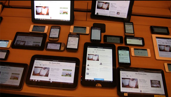
Though it’s still a beta release, Shadow may well be the most useful thing Adobe has ever built for web developers, particularly those that have embraced responsive design. It’s no secret that, while responsive design allows developers to easily target a wide range of screen sizes, it adds a considerable amount of work to the development process. But with Shadow mirroring your website across dozens of devices at the same time, testing becomes simple and easy. It’s a bit like synchronized swimming for web browsers. 

Read the rest here:
Adobe Shadow Simplifies Mobile Web Testing | Webmonkey | Wired.com.

Categories
Images Quotes

The 5 Hardest Jobs to Fill in 2012 | Inc.com

This is GREAT news for me and my peeps!

Creative Design and User Experience

After engineers, the biggest challenge for companies is finding high-quality creative design and user-experience talent.  Since almost every company is trying to create a highly compelling user experience that keeps people engaged with their product, it is tough to find people who have this type of experience especially with mobile devices including tablets and a demonstrated track record of success.

via The 5 Hardest Jobs to Fill in 2012 | Inc.com.

Categories
Articles

Touch User Interface – Touch Screen and Multi Touch: Paper computer shows flexible future for smartphones and tablets – YouTube

Touch User Interface – Touch Screen and Multi Touch: Paper computer shows flexible future for smartphones and tablets – YouTube.

OH MY….

Categories
Articles

User Experience Director and/or/vs Creative Director

A recent conversation regarding a project at work has me thinking a lot about what a Creative Director’s role is in the interactive space. I found this article about it  User Experience Designer vs. Creative Director | UX Booth and the comments are actually more informative than the article itself.

The article was written in 2009. Two years later, I think the topic is still one that hasn’t been fully explored and is still very relevant.

I tend to agree with some of the comments about how the role of “traditional” Creative Director and UX Designer are starting to blur (depending on the type of shop you’re working in), but at the same time I see how in the future there should be a separation between the two.

I keep trying to beat this into the minds of the traditional creatives I’ve had the pleasure of working with for the past six months:  “At the end of the day if we make the experience for the user a good one, they will be happy. A happy end user will make for a happy client. A happy client will make for a happy agency.”

Some creatives struggle with this notion because the “big idea” doesn’t always translate well onto the web and they feel then the site design isn’t “creative” and won’t win awards. I would beg to differ! What we do as interactive designers and developers is create a space online where content is used as well as consumed. Our job is to make sure that content can be consumed quickly, easily and as expected. To me that is the “big idea” and to do it well, you have to be creative as hell as well as analytical and detailed-oriented.

Another mantra I’ve adopted recently: “We build things that are used while traditional creatives build things that are consumed.. there is a big difference.” As a Creative Director in the interactive space, you have to understand this and believe it in order to achieve success for your client, and you have to be able to communicate this to the client when moving a campaign to the web or creating one specifically for the web.

“Big ideas” don’t work the same way on the web as they might for TV or print advertising. Think about your favorite web sites. Do these sites have a campaign behind them? or is there one “big idea” that dominates the site? I bet your answer is NO. Think about that for a moment. It’s the content and how that content is executed that makes it a great site.

Now this isn’t to say that all sites can’t be cool and fun and creative, but there is a time and place for that and herein lies the real challenge. To know when to flex your creative muscle and to know when to make sure the user is happy.

User Centered Design
User Centered Design Infographic