When I started working at Dick’s Sporting Goods (DSG) about a year and a half ago, I knew that one of the most important things I could do here would be to help the company redesign the e-commerce site. I was finally given the opportunity earlier this year.
The site was suffering. The look/feel was falling behind fast, it was outdated and heavy. There were gradients in the navigation, the CTA’s looked like they came out of a 2005 “15 Cool Gel Buttons Styles” article from Smashing Magazine, the 960 box it was in was making the brand feel small and behind the trends, there were some usability issues with orange on green text links, etc. I could go on and on but it was just plain ugly and no one really liked it.
The biggest problem with the site’s old design was the black background. Not really the background of the whole site but just the background of everything outside of the 960 box. As a designer this box we were in really made it difficult to create an engaging design for a landing page or banner. It always felt like we were simply filling in boxes. We were constrained in a big way and I knew that simply changing the background to white would change the site fundamentally… so thats what we did.
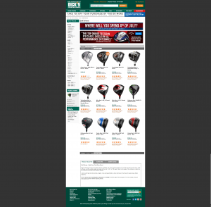
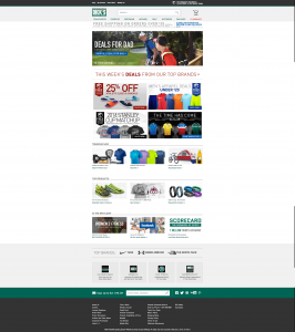
Here are examples of the old Homepage as well as an interior Category Page:


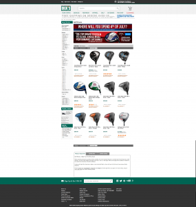
Below you can see the site after the header and footer redesign.

