OH MY….
Category: Articles
After moving my blog over to Tumblr, I decided I wanted a forum on the site. Well low and behold… this awesome tut using Pnyxe. Check it:
How to Add a Forum to Your Tumblr Blog – How-To Geek.
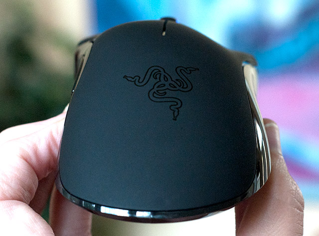
Razer Mamba Mouse Review
A recent conversation regarding a project at work has me thinking a lot about what a Creative Director’s role is in the interactive space. I found this article about it User Experience Designer vs. Creative Director | UX Booth and the comments are actually more informative than the article itself.
The article was written in 2009. Two years later, I think the topic is still one that hasn’t been fully explored and is still very relevant.
I tend to agree with some of the comments about how the role of “traditional” Creative Director and UX Designer are starting to blur (depending on the type of shop you’re working in), but at the same time I see how in the future there should be a separation between the two.
I keep trying to beat this into the minds of the traditional creatives I’ve had the pleasure of working with for the past six months: “At the end of the day if we make the experience for the user a good one, they will be happy. A happy end user will make for a happy client. A happy client will make for a happy agency.”
Some creatives struggle with this notion because the “big idea” doesn’t always translate well onto the web and they feel then the site design isn’t “creative” and won’t win awards. I would beg to differ! What we do as interactive designers and developers is create a space online where content is used as well as consumed. Our job is to make sure that content can be consumed quickly, easily and as expected. To me that is the “big idea” and to do it well, you have to be creative as hell as well as analytical and detailed-oriented.
Another mantra I’ve adopted recently: “We build things that are used while traditional creatives build things that are consumed.. there is a big difference.” As a Creative Director in the interactive space, you have to understand this and believe it in order to achieve success for your client, and you have to be able to communicate this to the client when moving a campaign to the web or creating one specifically for the web.
“Big ideas” don’t work the same way on the web as they might for TV or print advertising. Think about your favorite web sites. Do these sites have a campaign behind them? or is there one “big idea” that dominates the site? I bet your answer is NO. Think about that for a moment. It’s the content and how that content is executed that makes it a great site.
Now this isn’t to say that all sites can’t be cool and fun and creative, but there is a time and place for that and herein lies the real challenge. To know when to flex your creative muscle and to know when to make sure the user is happy.

After tinkering around with the settings for 3 days and reading multiple forums and articles about color calibration, I think I NAILED IT!
If you’re looking for color settings for your Samsung LED LCD D series unit.. try this:
Picture Mode: MOVIE
Backlight: 15
Contrast: 100
Brightness: 48
Sharpness: 36
Color: 50
Tint: 50/50
Screen Adjustment Sub Menu
Picture size: Screen Fit
Position [grayed out]
PC Screen Adjustment [grayed out]
Auto Adjustment [grayed out]
Advanced Setting Sub Menu
Black Tone: Darkest
Dynamic Contrast: OFF
Shadow Detail: 0
Gamma: 1
Expert Pattern: OFF
RGB Only Mode: OFF
Color Space: CUSTOM (see below)
White Balance (see below)
10p White Balance: ON (see below)
Flesh Tone: 0
Edge Enhancement: OFF
Motion Lighting: OFF
xvYCC: OFF
LED Motion Plus: OFF
Picture Options Menu:
Color Tone: Standard
Digital Noise Filter: OFF
MPEG Noise Filter: OFF
HDMI Black Level [grayed out]
Film Mode [grayed out]
Auto Motion Plus: OFF
Color Space Submenu:
Red: Red 59, Green 5, Blue 0
Green: Red 20, Green 55, Blue 3
Blue: Red 0, Green 5, Blue 100
Yellow: Red 57, Green 50, Blue 0
Cyan: Red 14, Green 51, Blue 55
Magenta: Red 50, Green 5, Blue 59
White balance submenu:
R-Offset: 24
G-Offset: 25
B-Offset: 26
R-Gain: 31
G-Gain: 25
B-Gain: 25
10p White Balance submenu:
Interval 1: Red 5, Green 4, Blue 4
Interval 2: Red 0, Green 0, Blue 0
Interval 3: Red 1, Green 1, Blue 2
Interval 4: Red 0, Green 0, Blue 0
Interval 5: Red 2, Green 2, Blue 1
Interval 6: Red 0, Green 1, Blue 0
Interval 7: Red 1, Green 1, Blue 1
Interval 8: Red 2, Green 2, Blue 3
Interval 9: Red 0, Green 0, Blue 1
Interval 10: Red 0, Green 0, Blue 3
That’s what I’m using and it looks AWESOME!
I’m always on the prowl for well built, well designed and well… free wordpress themes. A recent project has me on the hunt again for the best new themes to be released this year. I try to not only find themes that are hot design wise but have all the latest back end bells and whistles. Enjoy. I did the dirty work and here is what I’ve found.
Below are the top 10 of the first quarter or so of 2011 (in no particular order).
WOO Themes – Placeholder
Release Date: 19th January, 2011

A “pre launch” countdown theme. This is a great idea and I’ve seen them popping up all over the place but of course WOO does it the best and they were smart by releasing it for free.
————————————————————–
WPCrunchy – BizPress
Release Date: March 20, 2011

WP Cruchy continues to put out quality premium themes for free, one of the few. This theme has a sweet slider, shortcodes, multiple page templates as well as a clean design that makes it easier to mod.
————————————————————–
Renova – Just words, your words
Release Date: March 31, 2011

This theme looks simple at first glance, but when you learn what it’s all about this thing is sweet! Best of all, it’s MOBILE READY!
————————————————————–
Whiteboard Theme Framework
Release Date: Feb 10, 2011
Whiteboard is more of a framework than a theme but still at it’s core it has a bare bone theme which gives a quality design team the ability to develop their own themes. What draws me to this framework is it’s ability to go mobile instantly via the Less Framework, an adaptive CSS grid system.
————————————————————–
The Scoop from wpStyles.org via Speckyboy
Release Date: Feb 15, 2011

Everyone loves a quality magazine style premium WP theme for free right? I love the styling on this theme, has a high end news blog feel with an interesting 4 column layout.
————————————————————–
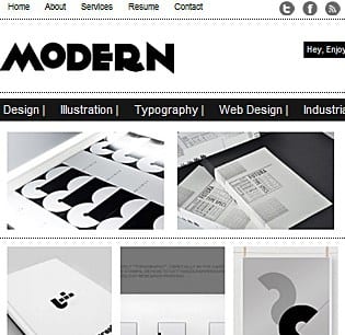
Modern Theme via Dessign.net
Release Date: April 5, 2011

If you like clean, Swiss-like minimalist design you’ll like this theme. Not a big fan of the cross out hover states but that’s an easy fix. This theme puts the featured image front and center and has a unique layout that I find appealing. It needs some modifying but it’s close.
————————————————————–
Spectacular
Release Date: Jan 10, 2011

Spectacular is a heavily designed theme released exclusively on Smashing Magazine. I typically try to stay away from graphic heavy themes as it makes them more difficult to mod, but there is something the color scheme in this that draws me in. With some great typography, great textures and muted color scheme this theme stands out form the crowd. I also really like the form design on the post pages. Good stuff.
————————————————————–
Degoy Magazine
Release Date: April 9, 2011

Simple WP Themes puts out a ton of “decent” themes but their latest one caught my eye. It’s really not a magazine theme (seems they just name everything “magazine”). To me this would make a nice sleek traditional blog theme, which we seem to be seeing less and less of.
————————————————————–
Garuda Di Dadaku – Tumblrish Theme
Releast Date: Jan 29, 2011

This one of the best free Tumblr-like wordpress themes I could dig up. I think it’s awesome how developers were able to take the functionality and theory behind Tumblr and transform it into wordpress themes. WordPress has many advantages over Tumblr and if you’re already into WP and don’t want to switch to Tumblr this is a great option. Not a huge fan of the graphics on this theme but that’s easily fixed.
————————————————————–
Easy Docs
Release Date: March 7, 2011

I love to see WP tweaked and pushed to the limits and it’s always interesting to see how a good designer/developer can use WP to make it do what they want it to . Easy Docs is a great example of that. The author needed a theme to help him document a project he was working on so BAM! a new way to use wordpress. Awesome.
Is FormSpring worth a damn?
Is FormSpring worth a damn?
Should Web Designers know HMTL/CSS?
I ran into a couple of articles today that discuss the issue of whether or not a “Web Designer” should know HTML and CSS. As a professional Web Designer, I’ve had this discussion with fellow designers and coders for years.
I’m not going to rehash the whole argument since it’s done so well here (Six Revision) and here (Full Stop Interactive), but being in the biz for 10 years I think I can throw in my two cents on the whole thing.
So the question is ‘Should Web Designers know HTML/CSS?’ The short answer is YES.
The long answer is, YES, to design a website properly the designer MUST know how the back end of things work and why wouldn’t a web designer want to understand how his or her designs are built? It just seems crazy and anti-productive to me to not know HTML/CSS
If you put two web designers side by side, with the same graphic design skills.. one has HTLM/CSS working knowledge and the other has no interest or idea how to code their designs, I can’t imagine the designer without the HTML/CSS knowledge would be able to output a design that is true to the web.
This is why Print Graphic Designers make such HORRIBLE web designers. It’s obvious to me when I see a design created by a print designer or a web designer without the coding skills set, they just don’t think everything through. (trust me I see this all the time) They don’t consider how the background will render on different monitor sizes, or where the “fold” is, or how their design will translate to mobile. These are all things a designer should consider. I think one learns these skills when they actually have to build out their own designs.
Learning HTML/CSS is easy, mastering it… not so much. A web designer doesn’t need to master it, just understand it and stay on top of the technology they are designing for. I know for a fact that the majority of print designers understand how paper affects their designs and can not be taken lightly.
This isn’t to say that a Web Designer SHOULD do the actual coding. I like to leave that up to the experts. Much like the analogy of an architect building the actual house, they understand the materials and the techniques, but they don’t actually know how to run a cement mixer.
Thoughts?
Top 5 Free EVO 4G Apps (so far)
I’ve had the EVO 4G for a little over a week now and I must say that it is WAYYY better than my PalmPre ever was (although the webOS seems to handle multitasking a bit better).
Anyway, here is my list of the best apps I’ve found for this thing, in no particular order
- Layar Reality Browser – Super fun. Not quite up to it’s potential yet but soon will be and I predict AR (augmented reality) will change the way we use mobile within the next 2 years. It’s pretty awesome.
- Dropbox – If you don’t know what dropbox is, educate yourself son! The Android app for Dropbox works great and basically makes it super easy to get any file on your EVO. A must have.
- Tweetcaster (free) – This is the best Twitter app for the Android that I’ve been able to find. It’s interface is so-so but it’s fast and user friendly. I am hoping Tweetdeck comes out with one soon, but for now this is serving it’s purpose.
- AppBrain – This app is a NO brainer (pun intended). It helps you keep your apps organized and the interaction between the phone and the appbrain website is flawless!
- Fring – One of the best features of the EVO is it’s front facing camera. The phone comes with Qik installed but don’t be fooled. The video call app cost $5 a month. Fring does the same thing, but is way cheaper. FREE! It’s super easy to set up and you’ll be making video calls in no time… well once everyone else gets on FRING and has a front facing camera.
- Honerable Mention: Megaman Sounds and Ringtones – The name says it all. It’s awesome if you’ve ever played MM then you’ll love this app!

