Categories
Articles Managing Strategy

Why “I Don’t Know” should be encouraged

I would love to write long, though out post about the what I saying “I don’t know” really means, but G. Jason Head beat me to it and he’s spot on. A highly recommended read.

Three words that strike fear and disgust in project managers, creative directors and especially account executives in agencies across the globe.

Me? Well as a web developer and manager I embrace them.

I think it’s high time that we got rid of the stigma attached to “I Don’t Know”. This is especially relevant in the web development industry – where the technologies we use come and go as fast as the speed of light.

He makes some great points in this and it’s been my experience as a designer and as a manager that when interviewing candidates or talking with my team hearing someone say “I Don’t Know” typically is a positive. I appreciate it,  I expect it, and I want to know that the person I’m talking to is being honest and I can trust them.

For me it tells me that the person is self-aware. People that aren’t self-aware would try to bullshit their way through a question or a request and it becomes obvious immediately that they really have no clue what they are talking about. I am not sure why people try to do this. Like Head says in his article there is an old school stigma about it which is really sad and counter productive.

Head continues:

But you know who hates hearing this? Your colleagues who are not developers (especially those Client Service folks!). And I’m here to tell you that they need to lighten up a little bit. They should also want to hear you say this once in a while. It’s healthy. It’s normal. It tells your colleagues to trust you.


Categories
Articles

Redesigning a major e-commerce site

When I started working at Dick’s Sporting Goods (DSG) about a year and a half ago, I knew that one of the most important things I could do here would be to help the company redesign the e-commerce site. I was finally given the opportunity earlier this year.

The site was suffering. The look/feel was falling behind fast, it was outdated and heavy. There were gradients in the navigation,  the CTA’s looked like they came out of a 2005 “15 Cool Gel Buttons Styles” article from Smashing Magazine, the 960 box it was in was making the brand feel small and behind the trends, there were some usability issues with orange on green text links, etc. I could go on and on but it was just plain ugly and no one really liked it.

The biggest problem with the site’s old design was the black background. Not really the background of the whole site but just the background of everything outside of the 960 box. As a designer this box we were in really made it difficult to create an engaging design for a landing page or banner. It always felt like we were simply filling in boxes. We were constrained in a big way and I knew that simply changing the background to white would  change the site fundamentally… so thats what we did.

Here are examples of the old Homepage as well as an interior Category Page:

Old Homepage
The dark background made the site feel dated and cramped. This was the styling from more than 5 years ago. It was time for an update.


Old Family Page
Interior “Family” page.

Below you can see the site after the header and footer redesign.

newhp
Updated Header, Footer, and Background. Simple but dramatic changes.
newsite
Everything about the new design works.


Categories
Articles Design Events

NOTES: Future Insight Live – Monday Work Session

Interaction Design – Beyond the Wireframe

Interaction designers should be involved in all parts of “The Process” but typically only get used in the “Design” phase.

Mind Blowing moment #1: “The  Interface isn’t the solution!!”

Major step that is ALWAYS missing in design. NO STRATEGY behind the WHY of the site. Jumping to the interface isn’t the right solution. We don’t solve the problem without synthesizing or strategizing the solution.  This creates too many revision, no respect for IxD, and makes the designer crazy.

So how do we fix this problem of not thinking enough before jumping to an interface????

Things to think about:

  • Who am I working with?
  • Who can help me solve the problem?
  • What is the problem?
  • Who am I solving for?
  • What is information/content that I’m working with?
  • Modeling the solution (sans interface)
  • Getting the team on board <<< YIPES
  • What is the information priority?

———————-BREAK TIME—————————

Categories
Articles Brands Mobile

Brands’ Greatest Mobile Challenges

It’s always interesting to hear what brands perceptions are about a certain trend or new technology or method in web design. In this case: MOBILE.

An article today on Digiday show’s how some of the top brands in the country are thinking about mobile. I’ve personally uttered some of the same comments that these CMO’s and CEO’s are saying here so it’s nice to hear that some of the  conversation is making it’s way up the ranks.

Since I currently do not work at a “brand” but instead for an agency that handles many brands I would like to add my two cents. I think the greatest mobile challenge for brands is finding people, either in house or at an agency, that truly get mobile and have the brands best interest at heart. It’s been a struggle to get older traditional creatives and account people to think mobile first, which is the proper way to think about mobile if you’re going to venture into it.

Brands’ Greatest Mobile Challenges | Digiday.

Categories
Articles Development Mobile

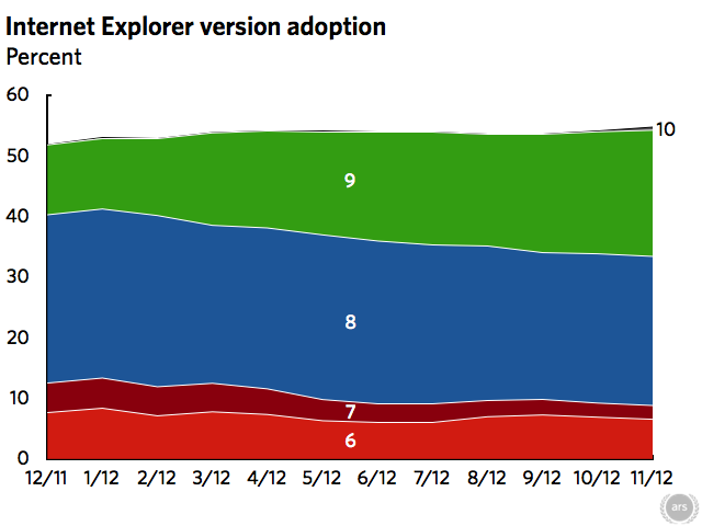
Windows 8 takes 1 percent of Web usage as Internet Explorer gains

This is a great article about web browser usage after the launch of Windows 8.

Most shocking thing about this whole article is that IE6 is STILL on the list. SIGH.

Read the whole article here on Ars Techinca: Windows 8 takes 1 percent of Web usage as Internet Explorer gains | Ars Technica.

Categories
Articles Tech/Gadgets

Google+ Photo Album sorting fix

Tutorial on how to get latest photos and videos (from phone) to show up at the top of a Google+ album.

So I’ve noticed that since the G+ redesign last week, that images you upload to an album via the “from phone” page get slapped to the BOTTOM of your album, not matter how you have sorting set up. It’s totally annoying, but I have figured out how to fix it (and I shouldn’t have to)

  1. go to the “from your phone” page to select the images/videos you want to move to an album.
  2. Select and highlight all the images you want to move.
  3. Click the Add To Album Button.
  4. Share or don’t share at this point. This to me is another annoying feature of G+ photos. I should be able to chose if I want to share the images I’m about to move to an album, not forced to “cancel”. But if you do cancel the share box, the images will still get moved.
  5. Go into the album you chose to move images into. WHAT? they aren’t there? Well scroll to the bottom of that album…BOOM. Thats where they are.
  6. If you want your latest images to be sorted to the top you have to click MORE > ORGANIZE ALBUM > and then click ORDER BY DATE twice. Then you’re lates images will be at the top.

WHEW.

Now all that being said, maybe I’m doing something wrong. If so let me know. Thanks.

Categories
Articles

Advertising Predictions for 2012 – WSJ.com

Advertising Predictions for 2012 – WSJ.com.

I find it interesting that the WSJ would report about AD Trends of 2012, send me to facebook to read it.. then have this in the article (which i totally disagree with)

“Facebook finally jumps the shark,” says Mr. Khabie of Digitaria, using a television-industry idiom that essentially means it’s downhill from here.

Facebook won’t jump the shark… thats just silly. It might flatten out because everyone with a flipping computer is on here, but it will not see a loss of members.

If anything we’ll see more integration with other services through Facebook. Much like the WSJ article I’m referencing.

One prediction I do agree with is that of my boss Michele Fabrizi predicting:

Along with small screens on store shelves flickering with product promotions, kiosk-like machines will offer personalized “product suggestions,” says Michele Fabrizi, chief executive officer of MARC USA. “So if you want to buy the same shade of lipstick or even the same color of paint, it will be able to remind you what you purchased previously.”

Of course that prediction hinges on better, faster, and more robust mobile networks. It might now happen everywhere in 2012.. but it’s coming. Are you ready?

Categories
Articles

3.7 million Android devices activated over Christmas weekend | The Verge

3.7 million Android devices activated over Christmas weekend | The Verge.

AMAZING. Android is taking over the mobile world. Love it. And I can honestly say that with ICS, they’ve outdone iOS (finally).

It will be interesting to see if they can start to force phone manufactureers to use only stock ICS and stop putting these horrible skins on them.

App downloads also exceeded any previously known levels, jumping to 242 million on Christmas Day.

Categories
Articles

GOOGLE ZEITGEIST: Here’s What The World Searched For In 2011

GOOGLE ZEITGEIST: Here’s What The World Searched For In 2011.

Google released a list of it’s top 10 searches for 2011. Couple of surprises on the list… Mainly Ryan Dunn #3 and Rebecca Black #1 (well actually RB doesn’t surprise me at all… Friday is a rad tune).

Categories
Articles

Will BostonGlobe.com give papers a blueprint to avoid Apple’s 30% cut? » Nieman Journalism Lab

Will BostonGlobe.com give papers a blueprint to avoid Apple’s 30% cut? » Nieman Journalism Lab.

Interesting article about how Newspapers can maybe follow the Boston Globes’ decision go to responsive to avoid Apples 30% cut.

So was this the REAL reason for the Globe going responsive? $$$$$

The key is that the app is written in HTML5, which makes it possible to publish a website offering a user experience similar to an iPad or iPhone app. Globe subscribers can simply point their browser to, type in their username and password, and enter a site that looks very much like an app written for iOS.

Because of the flexibility offered by HTML5, the site automatically formats itself to any device — an iPad, an iPhone, a laptop or desktop computer, even a Kindle, which includes a rudimentary web browser. Thus the Globe has found a way to avoid paying Amazon as well, though it will continue to offer a separate Kindle version.